Forgotten Heroes Vietnam: Unboxing
So I just got my copy of Forgotten Heroes Vietnam today and I'm pretty stoked about it so let's open it up and see what we've got here:
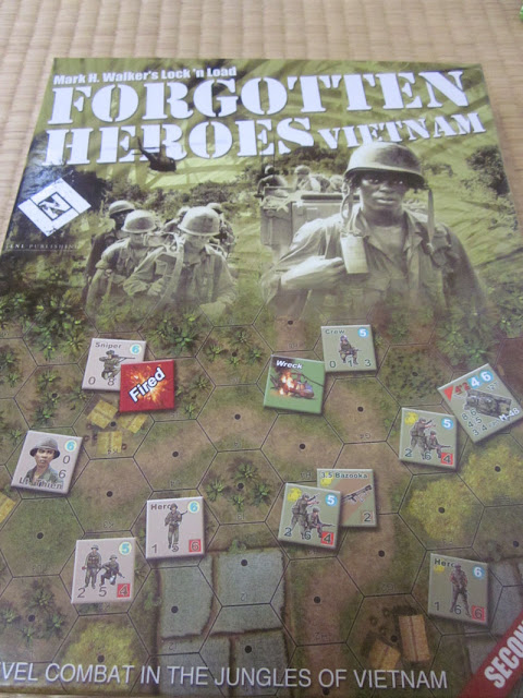
Nice box art with good use of color and photographs. Reminds me of the Heroes of the Gap box art with the use of counters in the middle and bottom of the box. It's a surprisingly heavy box too. Although I don't have a shot of the back, it seems a lot less "cluttered" in terms of text and art, which is a nice change from the "Band of Heroes" days.
Inside the box, we are greeted with the module rules, which has a nice color cover. The rules themselves are your standard LnL series rules with black and white photos, etc. What's great to see is that the rulebook now uses photos and examples from newer games like Heroes of the Gap and rules changes are now in italics.
The Module rules are of thick stock (which is a departure from the usual standard paper format) and presented in a "fold out" fashion with large font and features an introduction from Mark H. Walker as well as the standard national characteristics and module-specific rules.
Underneath those 2 books, we've got 5 geomorphic maps, two six-sided dice, the skill cards and other goodies. It's a tightly packed affair so you'll probably have to keep your counters in a separate box after you punch them out.
The Skill Cards look great and appear to be of standard playing card thickness, which seems to be a little thicker than the Heroes of the Gap skill cards. The illustrations on the cards are excellent and relate well to the card description. My favorite card happens to be "Lucky Man" which is a really imaginative and funny way to make the photo work with the card description.
Interestingly, the skill cards also contain a couple of cards that advertise other LnL games, Heroes of the Gap and White Star Rising. I've never seen that before in an LnL product so I wonder if this will be standard now. I'm not sure what to do with these advertisement cards...
The map boards look great and have the usual attention to detail. Of course, the terrain layout is the same as the first edition of the game but the art is updated and the halos have been removed from around the hexes. It really looks like you've got a God's eye view of the battle, peering down on some remote village in Vietnam that hasn't changed for a thousand years.
The scenario cards are a real step up from previous efforts with lots of use of color and well-organized information. I liked Heroes of the Gap but often found the color and background of the scenario cards seemed to make it harder to read the info at times. That problem has been corrected here. We also have the return of the turn counters on the card, which was sorely missed in Heroes of the Gap where the turn counter was literally right on top of the map (even on top of the terrain itself). I think this is a nice mixture of using the information organization from the older games (like Band of Heroes) on the cards along with the higher quality of presentation from HotG. Using both sides of the scenario card for one scenario works so much better than cramming all that stuff on one side of a card.
The leader illustrations seem a bit more lifelike and distinct than in Heroes of the Gap. I really couldn't distinguish Cpt. Boone from Sgt. York in terms of facial features but here in FH: Vietnam, each leader is very distinct and you can almost make out their personality from the picture. Well done.
I also loved the "in action" shots on the helicopter counters with the rocket flying out of the Huey. I hope LnL does more of this in the future as it looks pretty cool and adds a movie-scene sense to what's happening on the board.
It's also apparent that LnLP is committed to continually improving the overall quality of their product through tweaks here and there while still putting out distinct products that belong to the same LnL series. It's a tough balancing act in many ways because players of the series have come to expect a certain amount of consistency among the various LnL games and components while at the same time demanding new products that are unique from other games in the series.
I'm looking forward to Anzac Attack, the expansion for Forgotten Heroes, which includes Aussie and New Zealand forces in Vietnam. Line of Fire 12 has provided several excellent new scenarios for Forgotten Heroes as well, even incorporating the Vietnam maps as substitutes for Nicaragua in the Heroes of the Gap universe. So it seems that FH:Vietnam is well supported by LnL Publishing and we can expect lots of shiny new add-ons to the game in the future.
Update: After giving the game a quick spin and looking closer at the components, I have to say that my favorite bit is the fact that Mark has written some notes on the scenarios, which is terrific. I enjoy reading how some scenarios were tweaked or re-worked to add balance or flavor. It adds a lot to the game for me.
Nice box art with good use of color and photographs. Reminds me of the Heroes of the Gap box art with the use of counters in the middle and bottom of the box. It's a surprisingly heavy box too. Although I don't have a shot of the back, it seems a lot less "cluttered" in terms of text and art, which is a nice change from the "Band of Heroes" days.
Inside the box, we are greeted with the module rules, which has a nice color cover. The rules themselves are your standard LnL series rules with black and white photos, etc. What's great to see is that the rulebook now uses photos and examples from newer games like Heroes of the Gap and rules changes are now in italics.
The Module rules are of thick stock (which is a departure from the usual standard paper format) and presented in a "fold out" fashion with large font and features an introduction from Mark H. Walker as well as the standard national characteristics and module-specific rules.
The Skill Cards look great and appear to be of standard playing card thickness, which seems to be a little thicker than the Heroes of the Gap skill cards. The illustrations on the cards are excellent and relate well to the card description. My favorite card happens to be "Lucky Man" which is a really imaginative and funny way to make the photo work with the card description.
Interestingly, the skill cards also contain a couple of cards that advertise other LnL games, Heroes of the Gap and White Star Rising. I've never seen that before in an LnL product so I wonder if this will be standard now. I'm not sure what to do with these advertisement cards...
The Player Aid Card is pretty much the same high quality stock and layout as the "Heroes of the Gap" aid card. This time, there's a pretty sweet image of a Huey at the bottom of the first page. The terrain chart is inside and fire modifiers are on the back. It's well organized and easy to read. The thicker stock and lamination means that it will probably withstand a minor beverage spill or two, which is a big plus for a clumsy guy like me.
The scenario cards are a real step up from previous efforts with lots of use of color and well-organized information. I liked Heroes of the Gap but often found the color and background of the scenario cards seemed to make it harder to read the info at times. That problem has been corrected here. We also have the return of the turn counters on the card, which was sorely missed in Heroes of the Gap where the turn counter was literally right on top of the map (even on top of the terrain itself). I think this is a nice mixture of using the information organization from the older games (like Band of Heroes) on the cards along with the higher quality of presentation from HotG. Using both sides of the scenario card for one scenario works so much better than cramming all that stuff on one side of a card.
Lastly, there are two sheets of counters in the box. Here we have the NVA, ARVN, Marines and US Army forces represented along with your standard administrative markers. The counter art seems to be improved in a lot of ways. The weapons are a bit bigger and seem to take up more of the counter size.
The leader illustrations seem a bit more lifelike and distinct than in Heroes of the Gap. I really couldn't distinguish Cpt. Boone from Sgt. York in terms of facial features but here in FH: Vietnam, each leader is very distinct and you can almost make out their personality from the picture. Well done.
I also loved the "in action" shots on the helicopter counters with the rocket flying out of the Huey. I hope LnL does more of this in the future as it looks pretty cool and adds a movie-scene sense to what's happening on the board.
Conclusion: I think LnL Publishing got it right this time, especially in regards to the design of the scenario cards and the images for the leader counters. I can see that LnL is trying to find ways to advertise their existing products to casual buyers (through the admittedly cool-looking HotG and WSR "skill cards" as well as the ad for "Paris is Burning" on the back of the rulebook) and I think what might work much better is to just slip in a pamphlet that is separate and distinct from the game components. That being said, anything that helps to sell games to keep the company healthy is alright by me.
It's also apparent that LnLP is committed to continually improving the overall quality of their product through tweaks here and there while still putting out distinct products that belong to the same LnL series. It's a tough balancing act in many ways because players of the series have come to expect a certain amount of consistency among the various LnL games and components while at the same time demanding new products that are unique from other games in the series.
I'm looking forward to Anzac Attack, the expansion for Forgotten Heroes, which includes Aussie and New Zealand forces in Vietnam. Line of Fire 12 has provided several excellent new scenarios for Forgotten Heroes as well, even incorporating the Vietnam maps as substitutes for Nicaragua in the Heroes of the Gap universe. So it seems that FH:Vietnam is well supported by LnL Publishing and we can expect lots of shiny new add-ons to the game in the future.
Update: After giving the game a quick spin and looking closer at the components, I have to say that my favorite bit is the fact that Mark has written some notes on the scenarios, which is terrific. I enjoy reading how some scenarios were tweaked or re-worked to add balance or flavor. It adds a lot to the game for me.


Looks cool. Hopefully there are additional interesting cards like 'lucky man' for yah and it plays great. Long weekend here. Say hi to M for me!
ReplyDeleteThanks! Will do.
ReplyDelete